How to Design the Perfect Remove Before Flight Keychain: Visual Guide
1. Choosing the Right Size
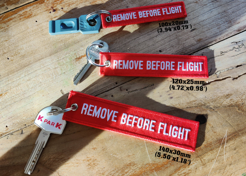
The first crucial step is selecting your keychain's size.
This choice will directly impact the readability and visual impact of your design.
A size too small will make text difficult to read, while one too large might be cumbersome.
Standard dimensions typically range between:
- 100x20 mm (3.94'x0.79') : compact format, ideal for minimalist designs
- 140x30 mm (5.50'x1.18') : classic format, offering more space for text and logos
⚡ Pro Tip: The 120x25 mm format (4.72'x0.98') offers the best balance between visibility and practicality.
This size allows for a respectable logo while maintaining excellent text readability, even from a distance.
2. Selecting Colors
Color choice is essential for creating both an aesthetic and professional keychain.
Each element must be carefully considered for optimal visual coherence.
For the background, you have two main options:
- Single fabric color on both sides (classic and elegant, perfect for a professional look)
- Two different colors (more dynamic, ideal for highlighting different information on each side)
✨ Design Tip: Bright red remains the most popular color, recalling the aeronautical origins of the "Remove Before Flight" concept.
For the border, essential elements to respect:
- Standard width: 3mm (an established standard ensuring durability and aesthetics)
- IMPORTANT: Same color on both sides (front AND back) for technical manufacturing reasons
- Recommended: Contrasting color with the background to create a striking visual frame
For contrasts, here are the recommended combinations:
- Black text on light background (maximum readability in normal conditions)
- White text on dark background (particularly effective on red or blue backgrounds)
- Complementary colors for optimal visual impact
Absolutely avoid:
- Tone-on-tone combinations (e.g., dark red on red)
- Low contrasts that harm readability
- Colors too close in shade that create visual confusion
✨ Free Resources for color selection:
- Adobe Color - Perfect for creating harmonious palettes
- Coolors.co - Excellent for exploring color combinations
- Pantone Connect - Professional reference for precise colors
Examples of recommended color combinations:
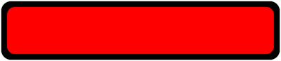
Classic Red
Background: #FF0000 (PMS 485) / Border: #000000 (PMS Black)

Bleu Marine
Background: #000080 (PMS 281) / Border: #FFD700 (PMS 116)
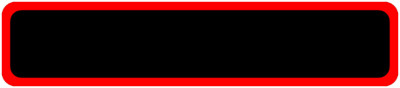
Noir
Background: #000000 (PMS Black) / Border: #FF0000 (PMS 485)
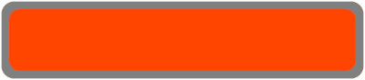
Orange
Background: #FF4500 (PMS 1665) / Border: #808080 (PMS Cool Gray 8)

Blanc
Background: #FFFFFF (PMS White) / Border: #0000FF (PMS 286)
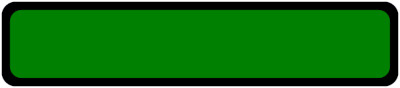
Vert
Background: #008000 (PMS 349) / Border: #000000 (PMS Black)
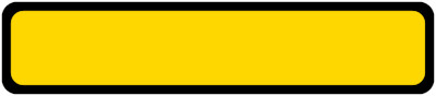
Jaune
Background: #FFD700 (PMS 116) / Border: #000000 (PMS Black)

Gris
Background: #404040 (PMS 425) / Border: #C0C0C0 (PMS 877)
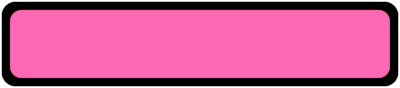
Rose
Background: #FF69B4 (PMS 806) / Border: #000000 (PMS Black)
3. Element Organization
The layout of elements on your keychain is crucial for effective communication.
A well-thought-out arrangement will allow for natural and pleasant reading.
For logo placement:
- Left position: traditional approach, natural left-to-right reading
- Right position: modern style, emphasizes text first
⚡ Pro Tip: Always maintain a minimum distance of 3-4mm between your elements and the border to avoid any readability or manufacturing issues.

Recommended information hierarchy:
- Logo: balanced size, visible but not dominant
- Company name: main text, larger and clearly readable
- Slogan or secondary information: smaller, optional
Elements to absolutely avoid:
- Email addresses (not clickable on a keychain)
- Complete URLs (difficult to remember and read)
- Phone numbers (prefer company name instead)
- QR codes (too small to be effectively scanned)
4. Design Software
Software choice is crucial for creating a professional and easily modifiable design.
We strongly recommend Inkscape for several reasons:
- Free and open-source software
- Intuitive and complete interface
- Vector format for optimal quality
- Export in all standard formats
- Large community and numerous tutorials available
⚡ Pro Tip: Always start by creating your design in vector format. This will allow for later modifications without quality loss.
Production Tips
- Always convert fonts to outlines before final export
- Check readability at actual size
- Test your design in black and white
- Save an editable copy of your file
Conclusion
A successful Remove Before Flight keychain combines:
- A clean design that focuses on essentials
- Contrasting colors for optimal readability
- Professional and readable typography
- A well-integrated logo that strengthens brand identity
By following this guide and using our tools, you'll create a professional and impactful keychain that perfectly represents your brand or message.
✨ Final Tip: Don't hesitate to create several versions of your design and compare them at actual size before making your final choice.